strange sounds from beyond

We were tasked to create a new visual identity for our selected client that could be translated into different physical and digital mediums within 5 weeks.
context
Strange Sounds From Beyond is a music festival held in the heart of Amsterdam, Netherlands. The festival brings together local music enthusiasts and emerging artists, offering a unique opportunity to revel in a wide array of musical styles, ranging from mainstream hits to avant-garde experiments.
client
team
Christopher Sung, Kirsten Mercado, Reina Kim, Vito Fan
roles
Interface Design, Graphic Design, Interaction Design, User Research, Visual Design, Video Editor
I worked with my team to analyze the works of Wolfgang Weingart’s graphic work and understand some of the principles behind it. I also pulled design principles from Ellen Lupton’s book “Graphic Design: The New Basics“. We combined our analysis and principles to ground our designs, landing on these posters throughout the weeks.
designing with principles
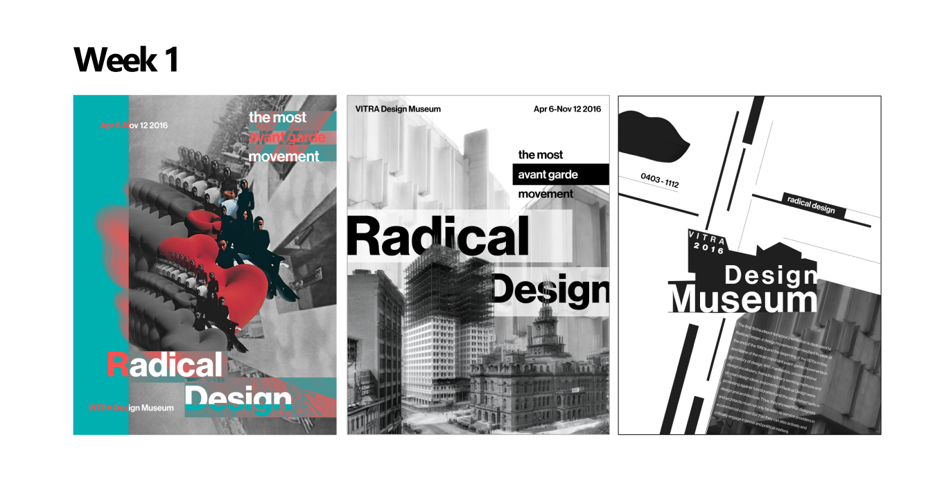
Eventually we landed on this poster, which I designed with the principles of:
Using geometric shapes to frame elements for separating content.
Using patterns in order to create texture.
I created assets that matched the principles from our poster.
final direction
Before I started the microsite with our team, we wanted to create a content strategy and the direction of the microsite. I did research on Strange Sounds From Beyond to understand what kind of message they were trying to send to their audience.
onto the microsite
They incorporate artists of diverse musical backgrounds and talents, showcasing music that attendees may have never heard before, thus, the name of the festival. Based on our research we had come up with the following framing statement and user flow to guide our microsite:
initial framing
How might we get potential music festival attendees to explore music from participating artists through a non-objective lens?

As we learned more about the artists, we focused too much trying to showcase different aspects of the artists. However, the objective of our site was lost, as we were not sure if we were trying to showcase the artists or find ways to promote Strange Sounds from Beyond.
lost in meaning
We also realized our target audience did not make sense, as attendees would already be interested in the artists. Instead we should have focused on showcasing the artists’ music to people interested in going to the Strange Sounds from Beyond.
revised framing
How might we provide a compelling experience with sound interaction in order to inspire site visitors unfamiliar with the festival to attend the festival in person?
We wanted to create an immersive environment where visitors would have to focus solely on the music their heard, before making any judgements on the artist. We achieved this by minimizing any artist names or song titles to allow free exploration based solely on sound.
sound exploration
Within the artist’s page, 5 of their songs are available for visitors to listen to, giving them a better idea of that artist’s sound. Additional details about each song can also be shown for those interested.
artist exploration
After going through the different artist and their music, visitors interested in purchasing a ticket through the link in each artist’s song page. Visitors can also quickly purchase a ticket from the link in the navigation bar.
ticketing
final microsite
This project was really humbling, as I felt myself really learning the basics of graphic design week after week. My team and I had never really pushed ourselves in a creative direction like this, so we had struggled really hard. to catch up with others.
Through this project, I was able to realize the importance of precedents and how we can analyze previous works to help ground our designs and ideas. I could definitely feel the improvement throughout the weeks as I learned how to draw inspiration from other works and use it to improve my own designs.
If I were to continue to work on this project, I would put more thought into the ticketing page, as I felt like it was rushed due to time constraints. Additionally, I would like to refine some of the micro-interactions, giving it that professional polish.
reflection